When asked about there work the brothers admitted that there “Designs is not just about function and form, but fantasy, emotion, thereby having a begging a middle and end.
They where latter asked the question: Does design follow Function?
The brother likened design to poetry, “design and function follow poetry. They have to form the soul of the design”. In that it has to connect with user on both emotional and functional levels. Witch they believe is a new thing “for people who are in contact with design”
Latter they where ask about the world situation, economic crisis and how it effected them
The brothers responded by telling how they started out in Brazil. Like much of the population they had no or very little money, so they used whatever had around them, and in doing so recycled a lot of things, not only this but kept very environmentally awear, much of the environmental awearness come from there father he had worked in and around the amazon, and had great respect for it. This effected how Fernando and Huberto viewed the rain forest. They also when on to say about there work and resourcefulness was “not our intention but our necessity and now we are in accord with the rules of today”
Fernando also said that crisis make people become more aware and more responsible. He said that its a positive thing. He went onto tell hoe Brail had a much worse crisis in that they had 8% inflation a day!
Then they were asked the million dollar question: How would you define good design?
Function and of course poetry. A design that communicates and connects with people, and that appeals and connects with everyone. Not just a select group
BROS. CAPANA
TBIOGRAPHY
1953 Birth of Humberto Campana in the Rio Claro area of São Paulo.
1961 Fernando Campana is born in the Brotas area of São Paulo.
1977 Humberto graduates from the University of São Paulo with a degree in law and starts practising as a lawyer.
1984 Fernando completes an architectural degree at the Art College of São Paulo and joins Humberto, who has given up law to become a sculptor. Together they experiment with designing and making metal furniture.
1989 The Campanas design the Casulo Shelf and exhibit their furniture in commercial galleries in São Paulo and New York.
1991 Development of the Favela Chair, made from scraps of wood found in a São Paulo slum.
1993 Design of the Vermelha chair and Card Board Collection.
1997 The Campanas exhibit in Milan and complete the design of the Cone chair. The Italian lighting company O Luce produces their Estela Lamp.
1998 Together with the German lighting designer Ingo Maurer, the brothers present the Project 66 exhibition at the Museum of Modern Art, New York. The Italian furniture manufacturer Edra starts producing their furniture beginning with the cotton string Vermelha chair. The Campanas teach industrial design at Fundação Armando Alvares Penteado in São Paulo.
1999 A retrospective of the brothers’ work is presented at Casa Franca di Brasil in São Paulo.
2001 Introduction of a jewellery collection for H. Stern.
2002 Development of the velvet upholstered Boa sofa and Sushi chairs made from off-cuts of fabric and carpet underlay for production by Edra.
2003 Design of the Prived Oca chandelier for Swarovski, the Austrian crystal company, and a collection of ceramic vases for Teracrea in Italy.
The original Multidao and Banquete chairs are created especially for Moss in the Campana’s São Paulo studio.
2004 Retrospective of the Campanas’ work at the Design Museum, London.
Teddy Bear chair first shown at Moss and released as twenty-piece limited edition.
2005 Design of Grendene fashion accessories inspired by Zig Zag furniture made out of PVC wires. Melissa Australia releases the Campana Heel, Campana Bag, Campana Tennis and Campana Aranha.
Multi-sided glass Brasilia table released by Edra.
2006 Involved in Latin American Design Foundation’s group exhibition Extremely White presented in Amsterdam.
A small range of Sushi II, III and IV chairs continue to be produced by Estudio Campana each year.
Friday, September 4, 2009
Thursday, September 3, 2009
Fernando & Humberto Campana

Background:
Drawing inspiration from Brazilian street life and carnival culture, the brothers FERNANDO AND HUMBERTO CAMPANA combine found objects – such as scraps of wood and fabric off-cuts – with advanced technologies to create a vibrant, energetic and definitively Brazilian approach to design.
Taking their cue from everyday scenarios and using unexpected combinations of found materials – such as rubber hose, tissue paper, string or furry toys –Fernando and Humberto Campana transform modest materials into objects that celebrate the discarded and mundane and are instilled with the spirit of contemporary Brazil that they describe as “zest for life”.
Neither brother intended to be a designer. Humberto, born in the Rio Claro area of São Paulo in 1953, originally studied law, but began to design furniture in the mid 1980s after Fernando, born in Brotas in 1961, had completed his architectural degree.
Central to their practice is the importance of materials. The challenge, as the Campanas see it, is to transform something poor into something decadent and opulent. In the Vermelha chair, the brothers tie and weave an abundance of brilliantly coloured cord through a metal frame. Their Sushi chair transforms strips of brightly coloured plastic and carpet underlay into decorative rolls which then ‘upholster’ a basic frame. This process of transformation has injected a new energy into contemporary design by presenting a bold, vibrant alternative to the rationalist ideals of the long dominant European modern movement.
The material tradition of Brazil is based on craftsmanship and economy of means. By experimenting with high and low tech materials and using artisanal techniques, the Campanas are able to harness the energies of their inherited tradition while defining a new aesthetic based on experimentation and advanced technologies. They have also created a fresh and surprising way of looking at things. By weaving the fabric of São Paulo into their objects, the brothers present a very personal portrait of their city. “Our designs were born in the street, from the urban kitsch of the popular quarters and contact with nature,” they say. “Whenever we can, we go back to our farm. Nature revitalises our ideas.”
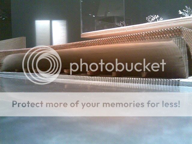
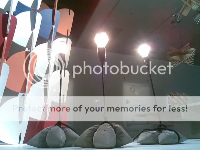
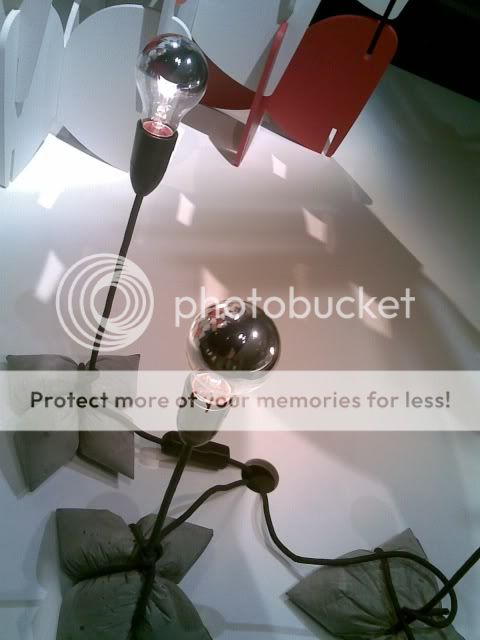
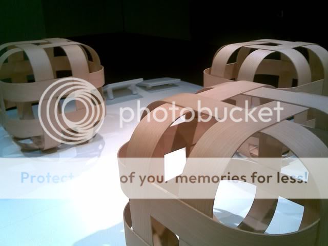
The Campana Bros. at the Vitra Design Museum
It’s expressed as being a retrospective exhibition of before and after the brothers collaborated. It consists of artistic sculpture’s shows a broad spectrum of art and design works.
It demonstrates the input of Fernando & his brother Huberto’s character and the differing approach to the works they took. They ustalised artistic style & approach which also worked with the designs , those styles being surrealism, cubism and also took forms similar to pop and “action art”.
Huberto took a more sculptural style and Fernando was more conceptual. It was also stated that there are works blurred the line between art and design, however “the functionality (of these works) is not as important as the image the portray”
The Concept of the exhibition:
To present artistic methods and motives (inspired by nature and the jungle - the amazon), those being organic, geometric urban and landscape.
Stay Tuned for the next instalment: Interview wit Fernando & Huberto Campana... . . .
MGA - Louis Porter's "Art"

MGA - Louis Porter:
Australian colour
Opening: 3.00pm Saturday 8 August 2009
To be opened by
Dr Shaune Lakin, Director MGA
Exhibition dates: 5 August – 13 September 2009
The art work/photography Louis showcased was from Altona to Hoppers Crossing, Deer Park to Thornbury, he traversed the urban landscape of greater Melbourne and Victoria, capturing colourful and uncanny moments with his camera. These moments could simply be passed of by the untainted eye as being arbitrary photos being taken by an amateur. What makes these photographs so special is the colour and composition, and the changing of viewers perception of his/her surroundings. Louis did this in a unique way, in that he used flash on a subject the had almost or full sunlight in it, plus he used over saturated film which gave a cereal spectrum of colour.
Australian colour presented his series of ink-jet prints, individually titled after the places where each image was shot. Exploring the character ofcontemporary Australia in the context of parking lots, industrial estates,
shopping precincts and residential cul-de-sacs, Porter’s photographs reimagined our everyday environment as a dreamscape, full of quirky possibilities and kooky coincidences.
Porter has described these works as “portraying familiar scenes that just
aren’t right”. With reference to colour and composition.
Louis said this about his work and method: photography is a “Version of realism and not the real thing” and in saying this he added further say that “he used over saturated colour to push the seeming real photos into an other dimension.
As a recent immigrant to Australia, Porter’s photographs might be thought of as the visual diary of someone exploring a strange new land. As such, he is
able to draw our attention to things that might otherwise go by unnoticed.
The photographs describe his route and take the viewer on a journey that is punctuated by colourful encounters with the everyday. His pace is pedestrian
and his viewpoint is street-level, but his sense of imagination is supernatural.
 In North Fitzroy (2008) the green bonnet of an iconic Aussie muscle car nuzzles into a flourish of garden shrubbery. It’s a strange collision of opposites, which somehow finds harmony in the vivid green that traverses the organic and the machine-made surfaces.
 Another Image that caught my eye was Terang (2008) the vivid orange and yellow shop front and bold type, collaborating with the space in front, that space being filled with the hard grey concrete and metal railing give the overall competition a solid structure. Along with this, is the centred type and sign writing witch has a harmony with Melbourne its self with its various laws and regulations with regards to owning a shop of this description, that “FEED PEOPLE CHEAP”.
Louis Porter was born in the north of England in 1977 and has been based in Melbourne, Australia since 2001. His work has been exhibited in
Australia, England , Canada and Austria.
This exhibition was in stark contrast with the Roger Ballen exhibition. What impressed me most about Louis is how he made art out of the mundane, and gave colour a new meaning to artistic photography.
So Louis my friend Rock On!!
MGA Roger Ballen, Art?

Roger Ballen was born in New York City, New York, USA in 1950. He has lived in Johannesburg South Africa since the 1970s. Beginning by documenting the small dorps or villages of rural South Africa, Ballen’s photography moved on in the late 1980’s and early 1990’s to their inhabitants; through the late 1990’s Ballen’s work progressed. By the mid 1990’s his subjects began to act where previously his pictures, however troubling, fell firmly into the category of documentary photography, his work then moved into the realms of fiction. His fifth book ‘Outland’ produced by Phaidon Press in 2001 was the result.
Awards:
* Art Directors Club Award Photography - 2006
* Selma Blair Witch Project - New York Times Magazine, October 31 2005
* Top 10 Exhibition, Matthew Higgs, Artforum-2004
* Citigroup Prize, finalist, UK - 2002
* Photographer of the Year,Rencontres d’ Arles - 2002
* Top 10 Exhibition, Vince Aletti, Artforum - 2002
* PhotoEspana, Best Photographic Book of the Year, Spain - 2001
* Photo-eye, Best Documentary Title, Best Photography Books of 2001
* Sani Festival, Best Solo Exhibition, Greece, 2000
* Special mention: UNICEF Photo of the Year 2001
BRUTAL TENDER
HUMAN ANIMAL
Mga
Roger Ballen
4th Sept to 1st Nov
This exhibition was work from 1983-2006, it was aiming to showed “what it means to be human, driven by fitful and forces barley understood” as the plaque on the entry of the gallery also when onto say that “it goes from documenting the world outside to documenting the imaginary world with in”.... hmmm??
The comment was made at this exhibition that “art doesn’t have to be beautiful” - if then art is not beautiful, then what is it??
The meaning of the word art:
“Art is the process or product of deliberately arranging elements in a way that appeals to the senses or emotions. It encompasses a diverse range of human activities, creations, and modes of expression, including music, literature, film, sculpture, and paintings. The meaning of art is explored in a branch of philosophy known as aesthetics.”
- Definition form From Wikipedia, the free encyclopedia
The word “Documentary”, would be a good word to describe this work/exhibition. The above definition does not suit the exhibition that we saw. This does not mean that we shouldn’t have gone to it, or that I think that it shouldn’t have been exhibited in this space.
My issue or “miss understanding” of Rogers Work does not lie in the first room of this exhibition however it does in the second room. I’m all for art being confronting, however I have quite the opposite opinion when it is ugly or disturbing - regardless how interesting or composition-ally impressive it may be. Art should not be something you walk away from feeling depressed or powerless, Art should leave you with a feeling of appreciation for your surroundings. In that art and composition can be seen in everyday life, it is just a chosen perception, appreciation and most importantly awareness of this that could possibly change your mood, encourage your creativity and of course put a smile on your face.
I respect Rogers ability and creativity. The quality of execution and competition in his work is of an impressive standard. However it’s content and subject matter (in the second room) was not to appealing to my creative pallet what so ever. But hey that’s “art” for you isn’t it what I like won’t be what you like will it?
Wednesday, September 2, 2009
Design Now 2009
National Graduate Exhibition
Melbourne Museum
Until 22 Nov 2009
Showcased young designers from across Australia. Australia’s young design graduates who have competed with fellow students to exhibit their work in Design Now.
The first thing I’d like to point out in this exhibition is that the curating was appalling it was so dark and the over use of hard light gave me a headache and I felt drained and could handle being in there for long periods of time. I felt it necessary to go check out farlap next door in order to change my mood.
Well now that I’ve got that out of the way, I’m was overcome by awe at this exhibition but I did find some of the designs to be really cool, and some...........Well not so cool.
I’ll start with the not so cool. The only one I felt it necessary to mention.
Naomi Fogel
Design: “Sound Bubble”
I found that although it looked pretty cool, I failed to see from a technical side what was so good about it, and found myself wondering why it was there...
Why was it so much better than what there already is?
How would it carry the base line and top end, any better that any other design?
The Following are some of the “Cool” Designs I found in the exhibition.
Renata Carmicheal
Design: “psecdofelis Majestica” and
“Candis Domesticus”
I understand and appreciate this design and the idea behind it. The design that bring man best friend even closer to human society in an inanimate way. Celebrating the form of man’s best friend. It earns the cred for being cool in its funk aesthetics whilst still be ergonomic and practical (like a 65’ VW beetle)

Alex Nicholl’s
Design: “Maritime Museum”
The idea of a “dramatic entrance incorporating a vast boat graveyards” or a “sculptor garden” of period maritime boats and ships, this would be a great idea and would set the mood. That mood being of awe and wonder of a time and era, that most people would not be awear of, and a took to educate the future generations in a captivating style.

Christina Waterson
Design: “Plexa#Form’s 2007”
Using Natural resources and a unique style the “Plexa” series are cool way of “personalizing ones surrounding” - as its soul reason is to look good and at to the surrounding I found it did this really well.


Henry Wilson
Design: “Bedrock Float”
Is an excellent partnership between aesthetics and ergonomics, ustalising cement’s properties in redirecting heat, that heat gained from the light itself, that light being “traditional Edison bullb”. In doing so, celebrating the bulb’s playful and much loved form.
and some others iI found really cool for no apparent reason

Melbourne Museum
Until 22 Nov 2009
Showcased young designers from across Australia. Australia’s young design graduates who have competed with fellow students to exhibit their work in Design Now.
The first thing I’d like to point out in this exhibition is that the curating was appalling it was so dark and the over use of hard light gave me a headache and I felt drained and could handle being in there for long periods of time. I felt it necessary to go check out farlap next door in order to change my mood.
Well now that I’ve got that out of the way, I’m was overcome by awe at this exhibition but I did find some of the designs to be really cool, and some...........Well not so cool.
I’ll start with the not so cool. The only one I felt it necessary to mention.
Naomi Fogel
Design: “Sound Bubble”
I found that although it looked pretty cool, I failed to see from a technical side what was so good about it, and found myself wondering why it was there...
Why was it so much better than what there already is?
How would it carry the base line and top end, any better that any other design?
The Following are some of the “Cool” Designs I found in the exhibition.
Renata Carmicheal
Design: “psecdofelis Majestica” and
“Candis Domesticus”
I understand and appreciate this design and the idea behind it. The design that bring man best friend even closer to human society in an inanimate way. Celebrating the form of man’s best friend. It earns the cred for being cool in its funk aesthetics whilst still be ergonomic and practical (like a 65’ VW beetle)

Alex Nicholl’s
Design: “Maritime Museum”
The idea of a “dramatic entrance incorporating a vast boat graveyards” or a “sculptor garden” of period maritime boats and ships, this would be a great idea and would set the mood. That mood being of awe and wonder of a time and era, that most people would not be awear of, and a took to educate the future generations in a captivating style.


Christina Waterson
Design: “Plexa#Form’s 2007”
Using Natural resources and a unique style the “Plexa” series are cool way of “personalizing ones surrounding” - as its soul reason is to look good and at to the surrounding I found it did this really well.


Henry Wilson
Design: “Bedrock Float”
Is an excellent partnership between aesthetics and ergonomics, ustalising cement’s properties in redirecting heat, that heat gained from the light itself, that light being “traditional Edison bullb”. In doing so, celebrating the bulb’s playful and much loved form.


and some others iI found really cool for no apparent reason


Liu Xiao Xian: From East to West
Born in China and raised during the Cultural Revolution, the artist’s provocative large-scale digital photography questions notions of cultural identity and home.
Liu Xiao Xian left Beijing for Sydney 20 years ago after the trauma of Tiananmen Square.
In the current climate between China and Australia, RMIT Gallery Director Suzanne Davies said it was important for a public gallery to hold an exhibition of Liu Xiao Xian’s work.
The examples of his work that stood out to me were:
“Home Rome 2003” - An art work in which a Chinese family is placed. The family is in front of a board with a Chinese style mural against the backdrop of Rome, Italy.
What this particular art work communicated to me was that, no matter where you go in life, you take your race, culture and identity with you. It also conveyed to me that this is not something to be ashamed of. I drew this conclusion from the way the family were smiling in the photo.
The case was very similar in the “Home Sydney 2003” piece.
“Game Set 1 2009” - Piece which its simple outlay and message. Having three demesnial large scale board, with Chinese checkers on one side and chess on the other. These where done in ceramic and coated in a turquoise/aqua colour (my favourite colour).
This art work demonstrated to me, the sheer contrast of, in essence the same game. One being played in the Chinese culture and the other being played in wester culture. The contrast was seen right through from the cultures they came from to the forms they took.
On one side you had the simplistic “checkers” and on the other you had complex depictions of a horse and castles.
“The Way We Eat” - Would have to be the stand out for me, its demonstration just how different the two cultures are. Rendered and displayed in much the same manner as the “Game Set 1 2009” piece. This particular art piece however is broken up into two sections, on one side there is a complete vintage cutlery set and on other side and a set of chop sticks, all are ceramic and coated in the same turquoise as “Game Set 1 2009”.
“The Way We Eat” looks at how different the implements used to eat are in each of the cultures. The westerner side shows the complex hirachey and formality of westerner/English etiquette.
On the other hand Chop Sticks is simple proficient and has a one size fits all approach. A has very no frills, no nonsense mode of eating.
“Great Wall Of China” - This is a unique art piece in that it encapsulates a vast space in a small room. Liu Xiao Xian did this by literally taking thousands and thousands of photos from top to bottom of the back of one of china’s biggest and oldest ceramic plate factories. At the back of this particular factory there are thousands of plates stacked up meters high. The photos Liu Xiao Xian took have been arranged to give a three dimensional recreation of what the site looked like.
The meaning of this rendition, I believe (Unfortunately I did not get to read the plaque for art work, so forgive me if I’m off the mark completely) that it represents how mas production has effected china’s reputation on the world’s scene. In that a lot of the products that come out of there have a short (or in some cases very short) planned obsolescence, and are easily accessible price wise to most product makers.
This is symbolised by the sheer number of plates chocking the otherwise green surroundings. Detracting from what might have been a luscious and green area.
-
The artwork itself didn’t amaze me, but I appreciated it, non the less. In that I appreciated the ideas and principals behind the work, how it contrasted so greatly to each other, and the element that were contrasted where often two very different way of going about the same thing.
^^^
I think i might have gone OTT again...
Subscribe to:
Posts (Atom)